
Stephanie Jung

Stephanie Jung uses what looks like a photograph but is placed on top of each other to create this shaken effect. Her pieces are usually city landscapes and some sections are even blurred out or faded. Stephanie uses a range of perspectives, distance and even vanishing points in her work.
In this work in particular, the artist uses bright vibrant colours, particularly the lights, however over all, the artist tends you uses strong colours such as black, white and purple.
Michael Tompsett
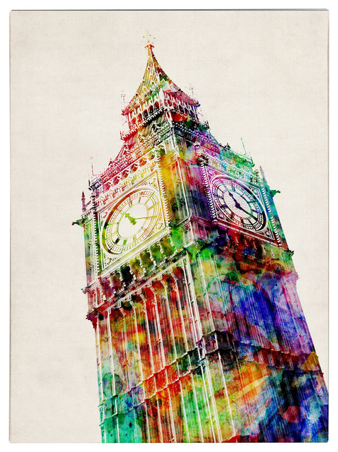

Michael Tompsett’s work usually involves buildings close up photographed at an irregular angle. She overlays rainbow like effects to create these textures within the famous buildings.
Tomsett usually prefers using bright and vibrant sharp colours in her work such as yellow, blue red etc…
Photoshop (Trying out techniques).
This is a work inspired by Stephanie Jung and i first started by taking a picture of a building in Preston and then took this picture within Photoshop.


I have then adjusted the hue, saturation and colour of the image until I was happy with the Outcome. I’ve done this by going into adjustments then Hue/saturation.

lastly I have over lay the same image on top of each other and then changed the opacity of those image to create this almost blurred effect. I’ve moved some of the images to also gibe this shaken effect just like the work of Stephanie Jung.
Final outcome

Evaluation
Over all, I am generally happy with the outcome however, What i should’ve done is to make the colours more saturated and vibrant particularly the sky to make it stand out and not look so dull. I really like the over all technique of this project as it was easy to do however, I did find myself lost because of the amount of layers doing this technique included. I think having so many layers on top of each other is also another reason to why the colours may looked faded out. To fix this, I should create less layers and name the layers so that they colours be easy to identify.
This is a diagram that I have made on the uses of the Marqueen and lasoo tool near the beginning of the lesson.

